In this blog, Sandra Duncan, EdD, and architect Lauren Magee, provide practical and helpful strategies for educators seeking ways to safely distance children in the COVID classroom.
For a closer look at the classroom layouts below, click each image to expand.
The unexpected journey of COVID-19 has presented many challenges about how to physically distance children within the early childhood classroom. There are literally no roadmaps to follow and certainly lots of speed bumps and detours along the way. One of the biggest challenges is how to set up and establish physical distancing while still maintaining some sense of community and normality for young children. The biggest problem facing teachers is the availability of space. Most classrooms are relatively small so there isn't the luxury of extra square footage. And, there probably isn't the budget and definitely not the time for adding space onto the classroom's footprint. The purpose of this blog is to offer strategies for reclaiming square footage from underutilized areas in the classroom and to offer ideas for room expansion without the cost of construction simply by using the square footage that is already available.
There is really no perfect solution to physical distancing in the early childhood classroom. First, we are asking for the impossible from kids: to stay far away from their friends. Young children are naturally sociable and inherently want to play with others. So, to ask them to "stay away" from their classmates is almost inhumane. For young children, 3 to 6 feet is a long, long way and, to further complicate the issue, their understanding of measurements is extremely limited. They really have no idea what 3 or 6 feet means.
One really wonders what the future impact of physical distancing will have on the social and emotional development of young children. What will the COVID-19 generation grow up to be like and how far-reaching will this monumental event affect their lives?
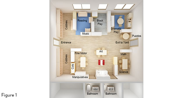
Secondly, physical distancing in an average-size classroom is almost impossible. There really is no perfect idea (or even a sliver of being perfect) when it comes to physically separating children in a typical classroom space. Let's do the math: With the requirement of an average 35 square feet per child in a traditional classroom designed for 20 children, the total amount of available square feet is 700. In a 700 square foot classroom, the 6' physical distancing rule for these 20 children takes up over 565 square feet. That leaves practically no room (only 135 square feet) for furniture, equipment, and learning materials. (Fig. 1)
Design Mistake #1: Grid-like Layout
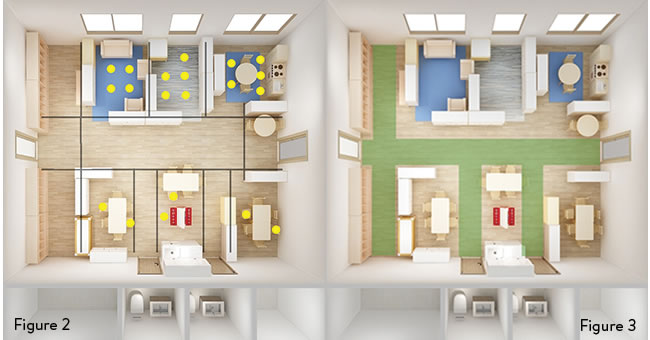
A common design mistake is arranging the classrooms in a grid-like fashion, which means that equal-sized centers are arranged around the classroom's perimeter or along the walls. This grid-type arrangement is done without consideration of the center's popularity or the amount of furniture needed to equip the area. The result of this type of arrangement is a classroom that is unbalanced with high levels of cabinet-heavy centers in some parts of the classroom and low levels of density in other areas of the room. In addition to the imbalance of the room's furniture, there is also an inequitable use of the furniture because children gravitate to some centers more than others. Take a look at this classroom design. Because the block area and dramatic play center are located together (see top right corner of diagram) and since these are popular centers, 50% of the children could end up in one quadrant of the classroom resulting in unacceptable crowded conditions in a COVID-19 classroom. (Fig. 2)
Solution: Break Free From the Grid!
Although the grid is a useful organizational tool because it provides equal space to all the individual interest areas, this type of design actually isn't equitable. All learning centers should not be of equal size. Some areas require more space because of the type of center and how children play within the confines of that space. Different spaces require different kinds of equipment and the amount of storage needed for the area. The first strategy for breaking free from the grid is to analyze the popularity of the center and the amount of storage required for the center. From these pieces of information, determine just the right size for each center. Rather than gridding the classroom's furniture around the outside perimeter, consider using an organic layout strategy. An organic design is a layout that allows the learning centers to break free from the traditional gridded constraints by (1) opening the face of the center so the front of it is free from shelving units; (2) repositioning popular centers in opposite corners; and, (3) reclaiming space, which will result in more opportunities to create distancing between children.
Design Mistake #2: Single-Purpose Walkways
Too much space is often dedicated to single-purpose walkways, which eats up valuable floor space that children could otherwise use. Although clear walkways are necessary for safety and egress, they can inadvertently limit the floor space. In this diagram, notice the (1) green areas that are representing walkways in front of the cubbies, (2) through the middle of the room, and (3) the two pathways to the restrooms. All this walkway eats up 210 square feet of floor space that could be better used by children. (Fig. 3)
Solution: Reclaim Space from Walkways
Reclaim space from walkways and fuse this square footage into children's play areas. In the illustration above, for example, the floor area in front of the cubbies is presently used only at arrival and dismissal times or perhaps when children retrieve their jackets to go outside. By reorienting adjacent learning centers, children can utilize this same floor area throughout the entire day.
Design Mistake #3: Too Many Cabinets
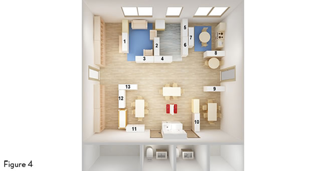
It's tempting to use cabinets to enclose the learning center spaces. This often results in excessive reliance on large pieces of furniture in an already crowded classroom. Another consequence of too many cabinets is that children's easy access to the learning centers is limited, and, therefore, popular centers can quickly become densely populated with children. (Fig. 4)
Solution: Remove Furniture
Reclaim space, improve flow, and increase usable floor area by moving or removing furniture. In the illustration above, each white storage shelf occupies 5 square feet of floor space. Simply by removing three of these shelves, you could get back 15 square feet of floor space that can be for children's use. If you're worried about not having enough storage space because of getting rid of shelving units, try incorporating medium-sized wipeable baskets and bins. These sized bins are easy to move so teachers have the flexibility to space children out around the classroom.
What Will This Look Like In My Classroom?
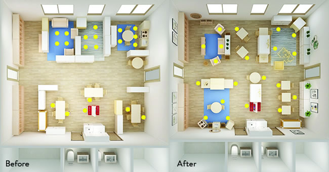
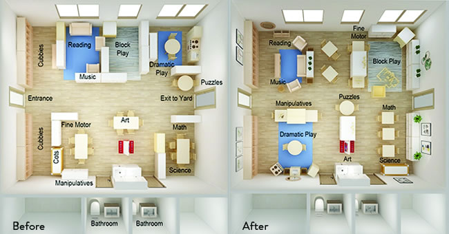
The purpose of this blog was to demonstrate strategies for physically distancing children in the COVID-19 classroom. The illustrations below demonstrate how children clump together in a traditional classroom configuration compared to a COVID designed classroom. The spreading out of children in the COVID designed classroom is obvious. In the "Before" density diagram, more than 50% of the children are concentrated in the most popular centers located in the top part of the room. In the "After" Density Diagram, the children are inherently spread out and are utilizing the entire square footage of the classroom.
All early childhood classrooms are facing a similar dilemma of how to gain more classroom space without the budget or time to do remodel. The solutions presented here are quick, inexpensive, and easy-to-accomplish. Don't call the construction contractor or architect. Rather, try using these ideas and strategies with your COVID-19 classroom!
About the Authors
Sandra Duncan, EdD
With over 45 years of experience and a doctorate in education, Dr. Sandra Duncan has a wide and varied background in early care and education. She has extensive experience in working with young children and parents, teaching at the university level, designing professional development programs for practitioners, and authoring several teacher resource books including Through a Child's Eyes, Rethinking the Classroom Landscape, Inspiring Spaces for Young Children, and Rating Observation Scale for Inspiring Environments (ROSIE). Most recently, Dr. Duncan brought her years of theory and best practices to the early childhood classroom in the form of the Sense of Place furniture collection—an exclusive to the Kaplan portfolio of furniture offerings.
Lauren Magee
Lauren Magee is the Director of Architecture and Environmental Design at Guidecraft, and design principal at LK Magee Architecture + Design. Her years of professional experience as an executive-level architect, her role as an associate professor of architecture at Drexel University and Illinois Institute of Technology, her recent tenure as an elected school board member, and her current work with students and teachers at all levels combine to enrich her inspired approach in the design of learning environments.
